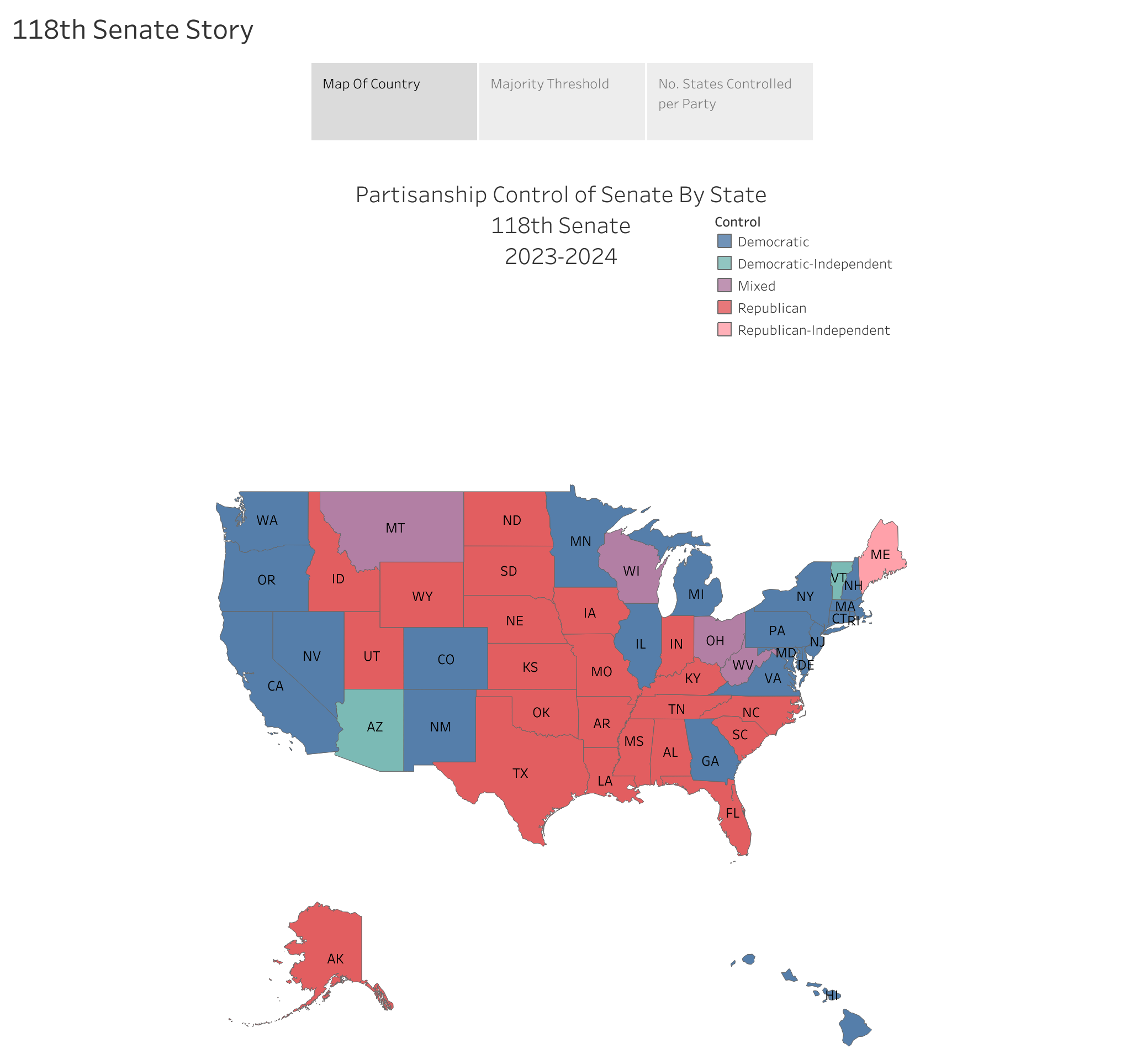
In this project, I collected public information and used it to visually the balance of power in the United States Senate.

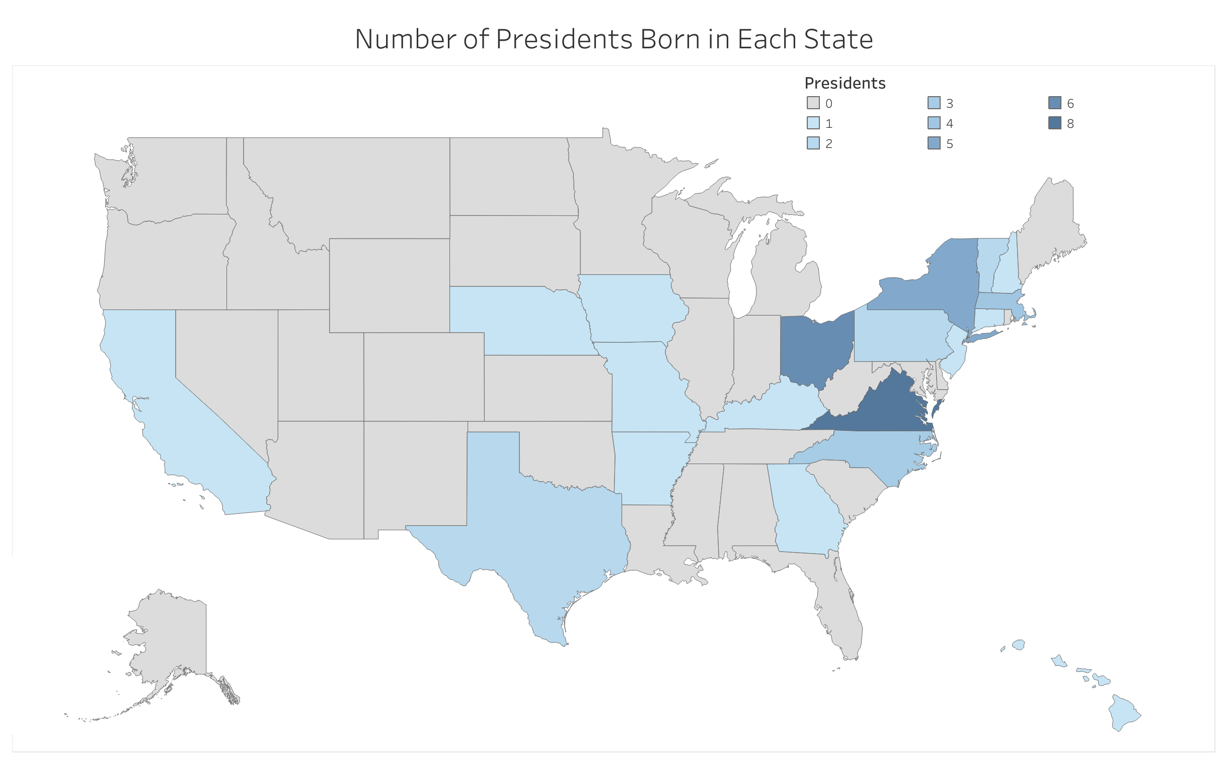
I created a spreadsheet with publicly available information on each President. I imported the spreadsheet into Tableau Public. I created three visualizations of the number of Presidents born in the state. One portrays the mainland states, one shows Alaska, and one portrays Hawaii. Despite Ohio's nickname, the 'Birthplace of Presidents', more presidents were born in Virginia than any other state.

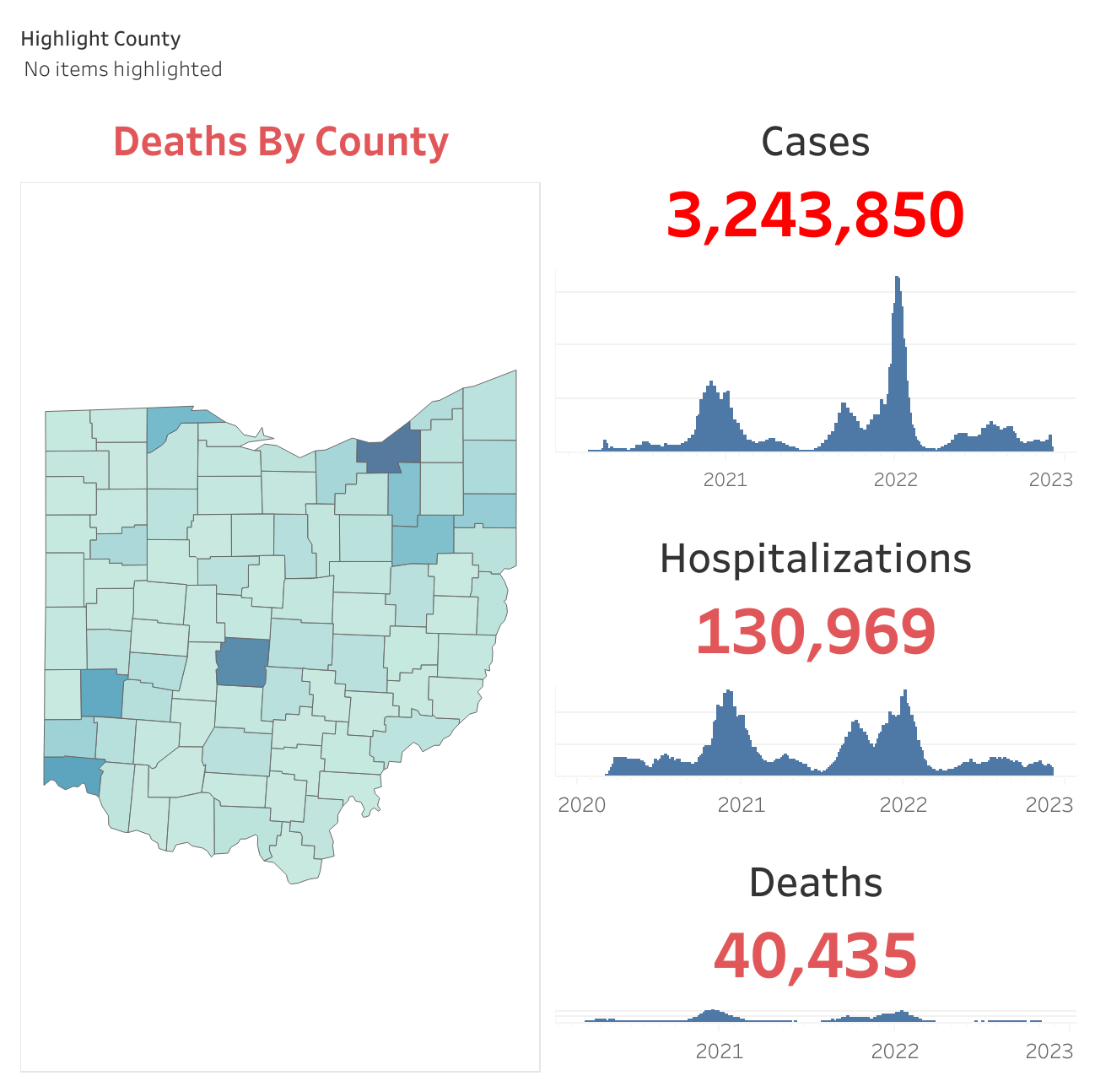
I imported this data from Ohio department of health into an XLSX spreadsheet. From that point the data was fairly well designed so creating visualizations of cases and fatalities at the state and county level was simple.